
The Power Of Color
Published on October 19th, 2015
by Craig Leweck, Scuttlebutt
I drive a Mini Cooper, but not for any romantic reason. I am not a car buff, nor know any of its history. I drive it because it is fun, practical, and easy to park. However, I soon noticed something about other Mini Coopers. It’s hard to find two that are alike.
Individuality is a Mini Cooper trademark. People find all kinds of ways to detail their car. This had also been true in sailing, but not as much anymore. Here’s a report from 2006 telling how Hobie Cat embraced the color concept…
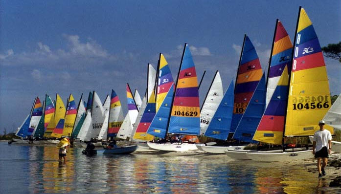
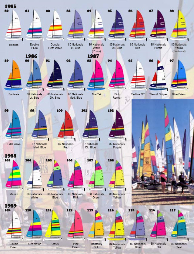
In the late 1960’s, only a few boat manufacturers offered colored sails, most notably Alcort, the makers of the Sailfish and Sunfish. Hobie Cats seemed made for color. But the first colors weren’t in the sails – they were in the hulls.
When you ordered a Hobie 14 in the late 60’s, you could choose from twelve different gel coat colors and you could select separate colors for the hulls and decks. From a distance though, you still couldn’t tell a Hobie Cat from any other sailboat. Hobie Cat needed something to make their product unique and with any luck, sell more boats. The fully battened sails were a natural canvas, so Hobie started introducing colored panels. The rest is history. Today, Hobie Cats and colored sails are inexorably connected.
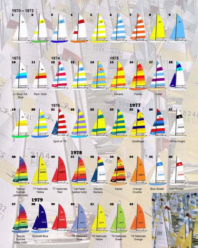
The first experiments with color were tentative – a single panel in the main and jib. Then alternating color panels were introduced and ultimately, whole sails of a solid color. In 1974, someone had a brilliant idea: package a full-color sail pattern with special hull and tramp colors, use the relatively new black anodized aluminum and give the scheme a name. Thus, the first named “package boats” – Banana, Orchid and the ever popular Flamer designs – were born in 1975.
In the late 70’s named package boats really took off. Who can forget the Tequila Sunrise, the most popular pattern ever? Also, in 1977, Hobie Cat began providing boats for the World and US National Champion- ships. In some cases, these had the new sail patterns for the coming year, but often, they would be custom patterns not available otherwise. Large, sail numbers in an ornate font replaced the plain identification numbers of the early sails. Eventually, the package names became associated with just the sails.
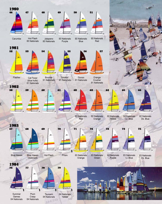
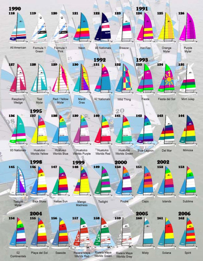
In the 1980’s, the number of color patterns exploded, driven by sailcloth dyed with multiple colored stripes. The popular Prism and Blue Hawaii patterns would not have been possible without this innovation. The dyed sailcloth was extremely versatile. It could be used in a single panel, with as many as eight different color stripes, or combined with a reversed second panel to create the “double” patterns. It could be moved around to different panels, but did not work well in the higher panels due to their increasing wedge shape. As boat production numbers waned in the late 80’s, the dyed material became harder to get in smaller quantities. The last pattern made with it was the All American in 1990.
But while the sail patterns were becoming more numerous, hull colors were being phased out. Sun fading and discoloration were real problems with some colors, so by the end of the 1980’s, hulls were limited to white, blue and yellow. The exceptions to this were the Stars & Stripes special edition of 1987 with gun- metal blue-gray hulls and its special commemorative sails and some of the 1989 Nationals boats had light gray hulls. With the exception of last year, the last provided boat Nationals was in 1989, but Hobie continued to supply a limited number of charter boats with sail patterns unique to the events.
In the early 90’s Hobie began to experiment with some completely different technologies to set their products apart. Sail window material became a design element in the ill-fated Formula 1 package. These sails were unlike anything seen before or since. They were teamed up with white powder-coated aluminum to create a striking look. Unfortunately, they didn’t wear well – the powder coating chipped easily and the sails stretched in odd ways, making them old before their time. They were quickly abandoned.
In 1990, Mylar sails were approved by the class for use with the Hobie 16. The same taffeta material (one side Dacron, one side Mylar) used for the Hobie 17 sails was used for the 16. A whole new look was available with the vertical cut sails. Hobie quickly found out that the taffeta material was ill-suited for the wear on the H-16 jib leech from the mast, so later versions of the sail patterns had conventional Dacron jibs. Ultimately, the Mylar sails were not as durable as the Dacron, or as fast, and the last Mylar Hobie 16 sails, appropriately named Twilight, were made in 1995.
In 1993, an experiment was made with a vinyl appliqué pattern – the Fiesta del Sol. The look was unique, but they didn’t sell very well. They weren’t very durable either, so vinyl appliqué patterns were abandoned, too.
The mid-to-late 90’s were Hobie’s lean years. Few new patterns were introduced and the color palette faded to somber blues, purples and greens from the hot neon colors of the 80’s and early 90’s. Towards the turn of the century, the palette became bolder, brighter and there was a definite shift in the names. Several of the older designs were named after cocktails – Breezer, Hot Fizz, Mint Julep and Mimosa. For Hobie’s fiftieth anniversary in 2000, patterns were named after famous surfing spots – Poche, Capo and Killer Dana (a Hobie 20 pattern). Today, the trend is towards positive names emphasizing sun, sand and the sea – Playa del Sol, Seaside, Solana.
The color schemes have always been greatly influenced by the availability of sailcloth. Hobie Cats use a cloth that is heavier than other small sailboat sails, so much of the colored sailcloth is custom made for Hobie Cat. This was not a problem in the 70’s and 80’s when thousands of boats were being sold each year and sailcloth was being consumed at a ferocious rate. Today, the color palette is limited due to the large quantity of cloth that must be purchased in custom colors. That’s why the current patterns use the same palette and panels are just rearranged to create new patterns.
The two world championships held in North America in recent years (1995 in Huatulco, Mexico and 2004 in Riviera Maya, Mexico) produced some striking sails. The 1995 sails are easily identified by the “reversed” class logo in the second panel of the main (instead of its usual third panel location) and the giant “O’Neil” logo down the leech. These sails were meant to be photographed from the starboard side, whereas the sails in the pattern guide show the port side of the sail. Thus, they have the logos reversed and as if seen through the sail cloth.
The Riviera Maya patterns, in addition to showcasing the national colors of Mexico, also have the Mayan god Choc Mool on the jib.
Source: Hobie HOTLINE

Related Posts

Don’t drink too much coffee →
Star Class: Securing the future →
Getting more sailors offshore →
 We’ll keep your information safe.